


This product aimed to foster partnerships among e-commerce businesses, enabling them to share customers and revenue. The solution includes a SaaS application that manages individual marketplaces, tracks orders, and analyzes revenue data. Additionally, the customer-facing platform allows shoppers to browse products from multiple brands and make seamless purchases from a single location.
This new product was built from the ground up, requiring a powerful backend for authentication, marketplace customization, and seamless e-commerce. With a tight timeline, we prioritized efficiency and industry best practices.
I worked closely with the client’s subject matter expert, senior stakeholders, and dev teams, handling wireframes, prototypes, high-fidelity designs, client presentations, and design system maintenance in Figma, plus Storybook support.
Lead Product Designer
Product strategy, Wireframing, Prototyping, Stakeholder Presentation, Hi-Fidelity Design
November 2024-February 2025
In the first two months of the project, we focused on deeply understanding our client's vision. They had a bold idea, and it was our responsibility to ensure the solution aligned with a SaaS application that could grow beyond the initial go-to-market MVP. During this period, we made significant progress as a team. We had long, in-depth sessions with our subject matter expert, product owner, and build team. Each session would drive our understanding further, and the team would document into thorough product-requirement documents that would help drive the wireframes. Though, soon, we discovered that we had been diving so deep into individual features, we forgot to take the time and think about the product as a large system working together.
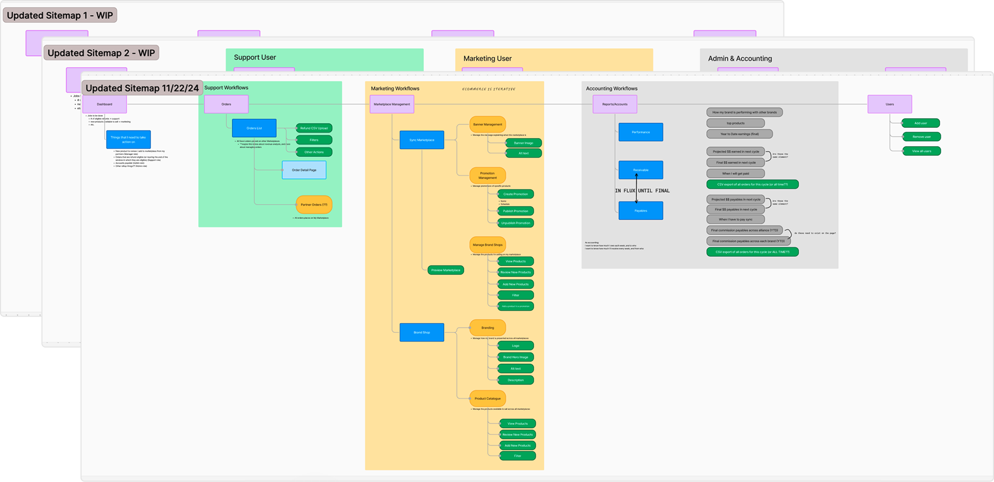
During this discovery time, we started wireframing based on the client’s desired features. While we had a solid understanding of what the app needed to do, we quickly realized we needed to take a step back and consider the product as a whole, rather than focusing on individual features. This approach helped us identify opportunities for simplification and more intuitive user flows. I think this has to be my favorite part of design. I am a sucker for a sitemap! It’s that holistic approach that allows you to see how each piece of the product works together for a certain reason for a certain user’s goal.
In an organization, there are major user roles that define the necessary workflows to successfully create and publish a marketplace, manage orders, and track commissions owed to partnering brands.
Decision maker who brought their brand into the partnership, financially invested their team and business’s time and resources

Invite team-members and assign roles
Track team’s workflows and support where needed
Analyze revenue data and trends
Oversees marketing or product operations for their marketplace
Customize marketplace branding and communication
Customize partner product listings offered to customers
Analyze revenue data and trends across products and brands
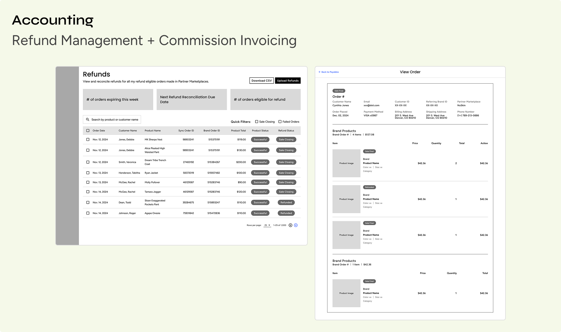
Oversees the product orders and tracking of commission both to be owed or received from partners.
Ensure all orders have correct refund status
Analyze sales data to invoice partners for commission-owed revenue
After gaining a comprehensive understanding of the entire system, we began wireframing the product. This was a crucial step for both us and the client, as it allowed us to visualize navigation and the basic functions on each page. Before handing off to the client for feedback, we created a prototype to further clarify the system’s flow.


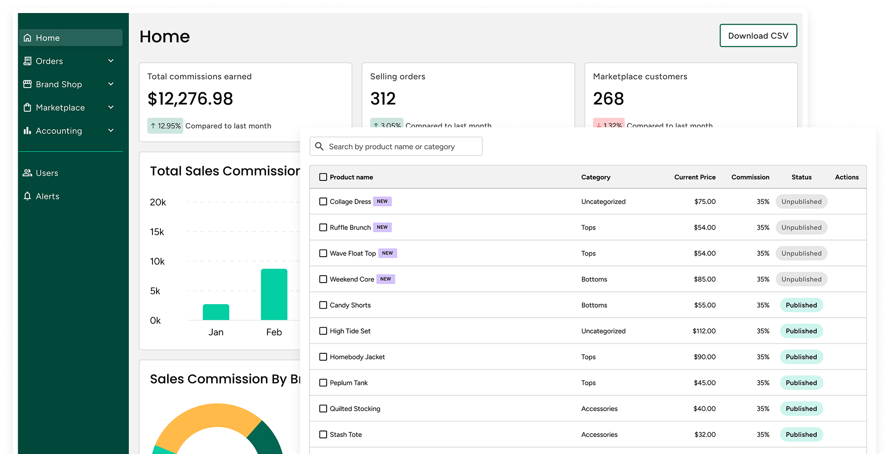
The dashboard was a critical page for the client, as it effectively communicated key performance metrics to c-suite-level users. Its primary purpose was to showcase the brand’s marketplace performance, including commission-based revenue, order volume, and customer sign-ups.
It was also essential to highlight top-performing brands and customer purchasing patterns. Understanding how products were bought together provided valuable insights for strategic partnerships, promotions, and bundling opportunities. Additionally, showcasing product performance allowed the brand to identify customer preferences, helping them make informed decisions about expanding their product offerings.

This section was crucial for marketplace managers, enabling them to efficiently filter products by brand and category. With these tools, users could carefully review, manage, and publish products, ensuring the right offerings were showcased for each brand partner.

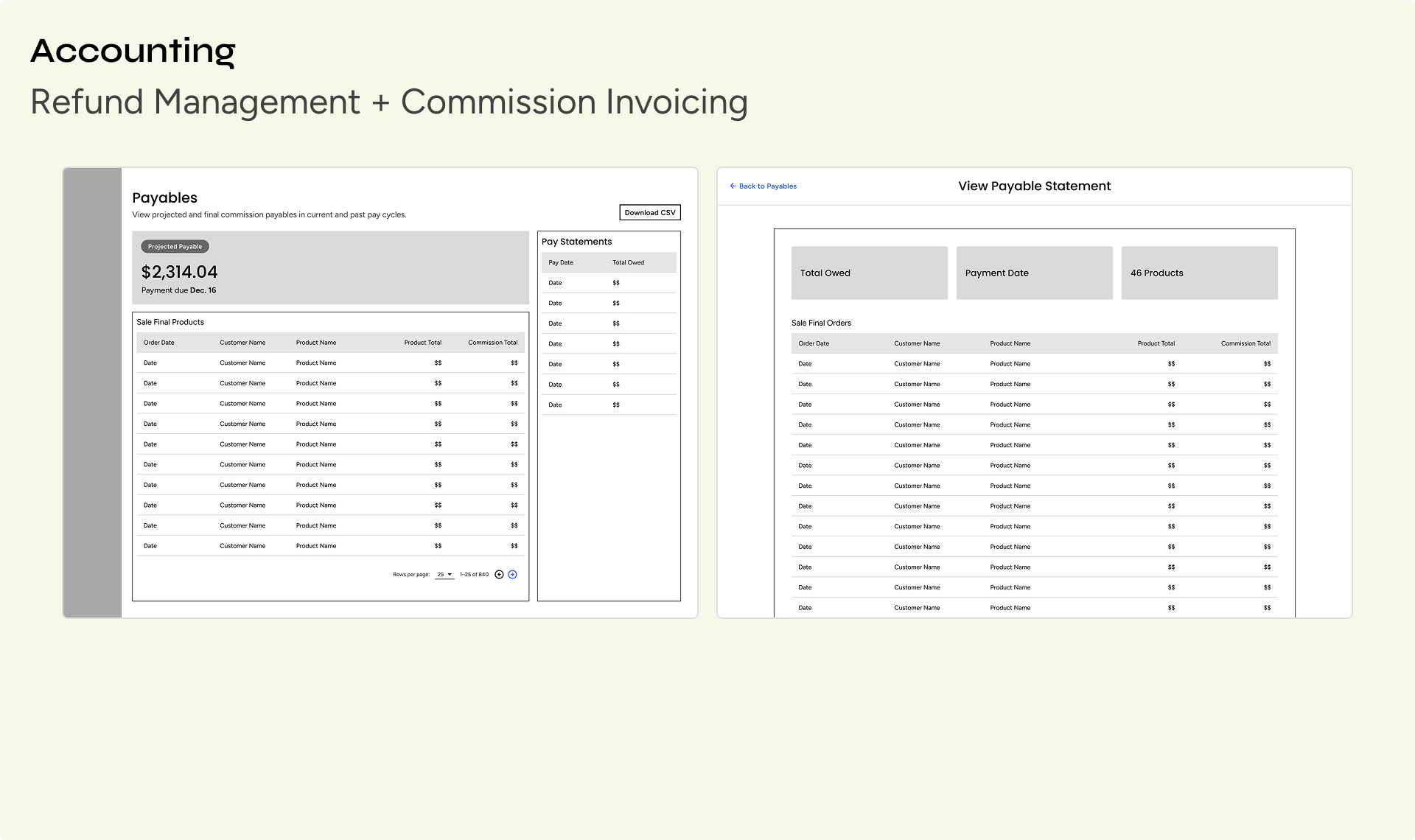
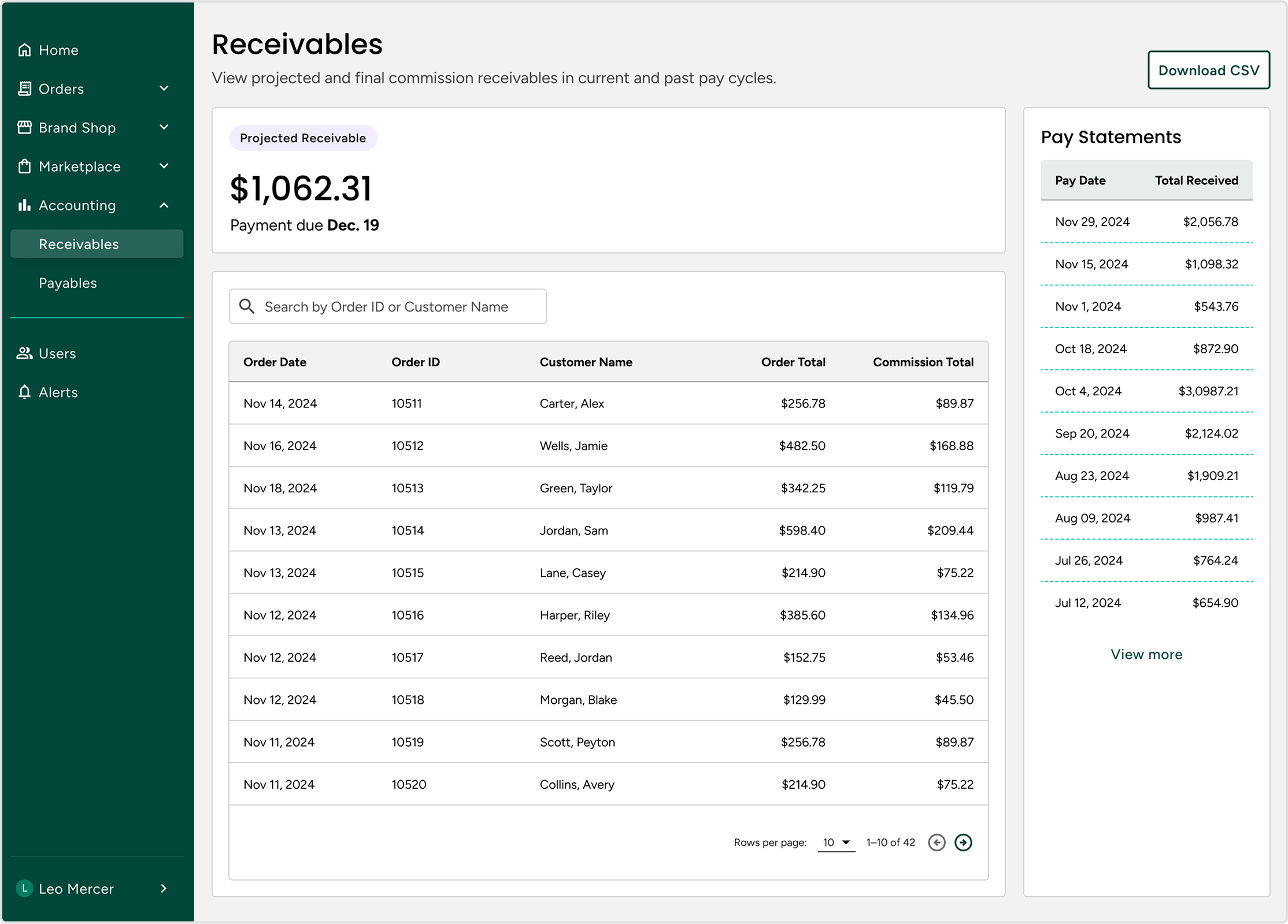
A key value of this product is uncovering brand partnerships and buying trends, while also creating an opportunity to generate commission-based revenue from selling other brands' products. This report was particularly important for users handling invoicing, as it needed to clearly display the total amount owed at the end of each pay cycle.
One challenge was that this total remained in flux until the pay period closed, at which point a new projected total would begin for the next cycle. Initially, we explored concepts that displayed both the current and projected totals, differentiating them with labels. However, after several working sessions with the team and client, we determined that the most critical data point was the projected receivable total until it became final. Once the payment date passed, a new projected total would take its place for the next cycle.
Making the best decisions
The primary goal of this project was to launch a functional MVP, allowing us to gather insights on what worked and what didn’t. In a project like this, relying on best practices and scalable design is essential.
Throughout development, we had several discussions acknowledging that some decisions weren’t our "ideal" solutions but were the best choices given the need for real user feedback. To move forward, we focused on building the simplest version possible while ensuring it could scale in the future. This made it crucial to establish a strong foundation (solid navigation and a cohesive design language) so that expanding into new features would be seamless.
An unexpected pause
It's important to acknowledge challenges in a project because building something from scratch comes with uncertainties. Unfortunately, about four months in, the project was put on hold as the client needed to shift their time and resources to other business priorities. These situations happen, but it meant we didn’t get the chance to see how the product would perform in the market.
Since success couldn’t be measured by user engagement, we focused on what we did achieve: working as a team to synthesize a vast amount of information and aspirations into a fully realized SaaS system. While we don’t know when users will interact with it, we take pride in the effort, thoughtfulness, and quality we put into the project.

